
One of our clients approached us to create two touchpanel interfaces: smaller panels that will be installed throughout an event space, and a single, larger panel that will be in a centralized location. The smaller panels will be used by guests to adjust lights and shades in the area, but also will be used to request help. The larger, central panel will be used by the concierge and employees to receive and manage those help requests. The client sent us a brief proposal and some guidelines:
- The guests can request three types of help: Food service, AV or technical support, or “something else.”
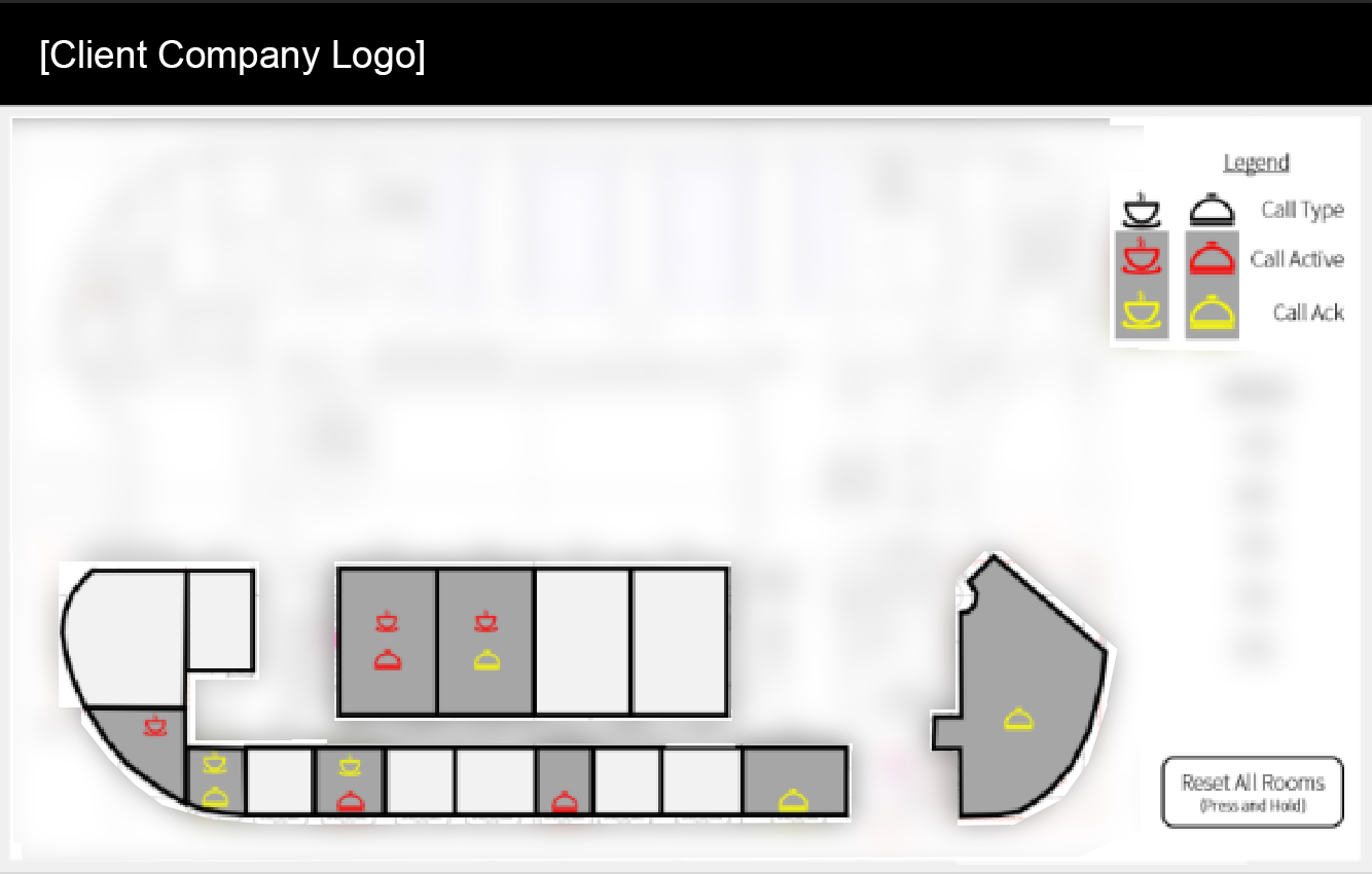
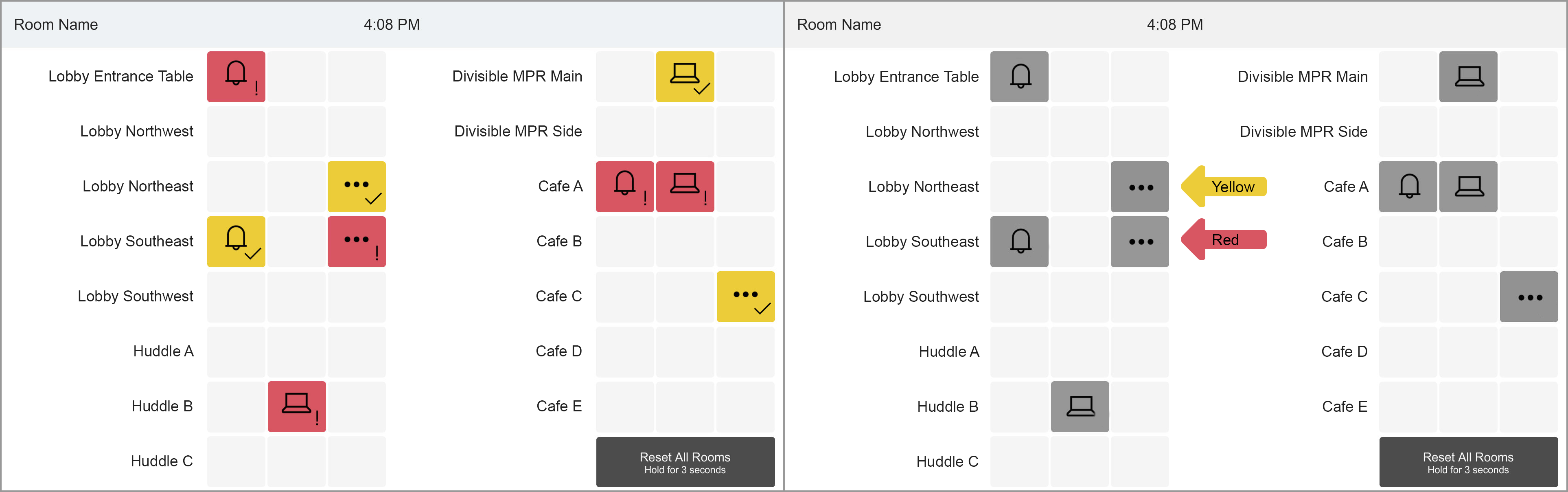
- When a guest presses the corresponding help button, the icon on the button should turn red on both the guest panel and the central, concierge panel.
- The employees will tap the red button to acknowledge the request, which will turn the icon yellow on both panels.
- Once the request is satisfied by the employee, they can tap again to return the button to its default state on both panels. Guests can also dismiss the request on their panel, and the employees should have a way to dismiss all requests on the central panel.
This was great for me – they had a clear idea of what they wanted and communicated it well. I began working on it and found a few problems, however.
The first issue was that while red was an appropriate color for an alert coming in on the employee panel, I felt that it would be indicating that something was wrong on the user panel. As a user, if I pressed a button requesting a waiter to come for a food order, I would expect positive confirmation, not a color typically used to indicate concern, an error, or danger. The second issue was more critical. The client provided a visual of how they wanted the buttons to look: red or yellow icons on a black button. This relied completely on the icon color to communicate its status which could be a problem for certain types of color-blindness.
For the first issue I decided to use blue as the active color on the button when a request was first sent, and green when the request was acknowledged on the concierge panel. Blue is the active color on the other buttons in the interface, and felt appropriate as an initial confirmation of the request. Green seemed like the right choice to then show that someone was on their way to help. I also added explanatory text on each button state to emphasize where they were in the process and avoid any color-blindness issues, mainly between the blue and green color (previous testing had shown sufficient contrast between the blue active state and black inactive state).
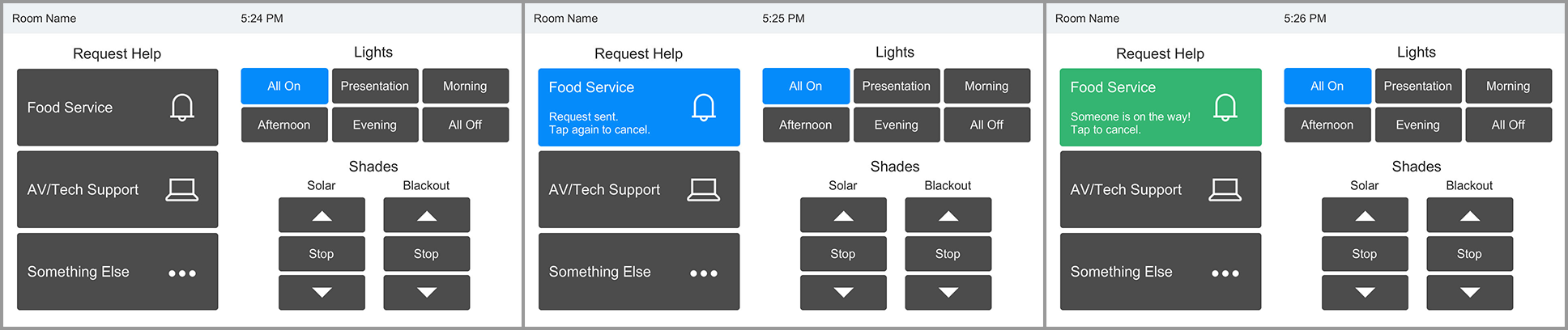
I solved the second issue (concerning only having the color communicate the state on the concierge panel) by including a secondary icon on the buttons. An “!” when a request is first received, and a check when it’s been confirmed. On the submittal document I included a screenshot showing what it looked like with all the color information stripped away, showing how difficult it was to see the difference between the yellow and red colors. Admittedly this would be an edge case. Monochromacy is very rare, and the other types I tested for were not this dramatic.
In this case, the client was receptive to the changes we were proposing and were happy for the guidance.