
One of the products at our company acts as a bridge between the client’s existing scheduling systems and a range of devices that allow room reservations for meetings and conferencing. These can be web interfaces, room signage right outside said room, or even mobile devices. A few years ago I designed the interface for the room signage touchpanels. They are interesting because they must first act as displays, communicating at a distance the status of the room. My intention was for the user to initially see the color communicating its status: green for available or red for occupied, with large text backing that up (“Available” or the name of the meeting taking place inside).
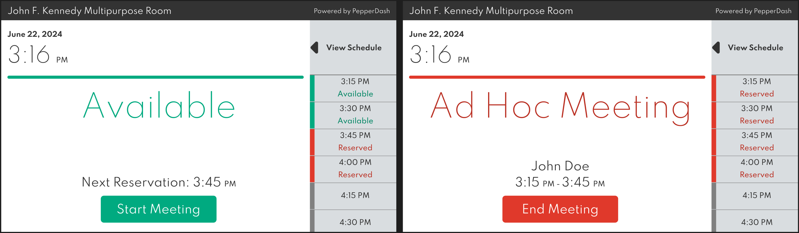
Secondary information includes the current date, time, and schedule for the next hour or so. The right side of the panel scrolls, allowing a user to look ahead past the next hour until the end of the day. Tapping on the right side will expand out the schedule and give the user access to more details and control for reserving spots for the current day, as well as future days.
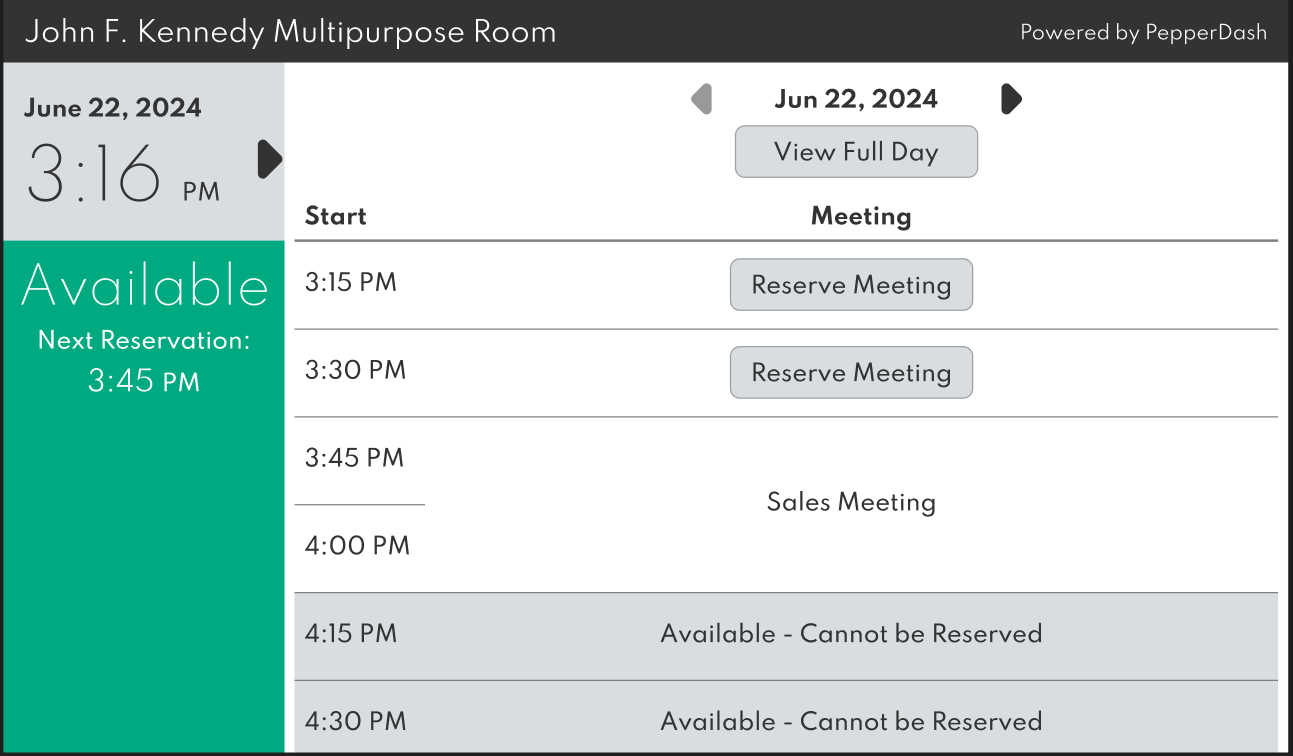
Users can continue to scroll through the remainder of the current day or tap “View Full Day” to display and scroll to the morning. Arrows next to the date allow the user to view different days. Tapping “Reserve Meeting” on a time block will prompt the user with a modal where they can type the name of the meeting and the length (15, 30, 45, 60, or 120 minutes).
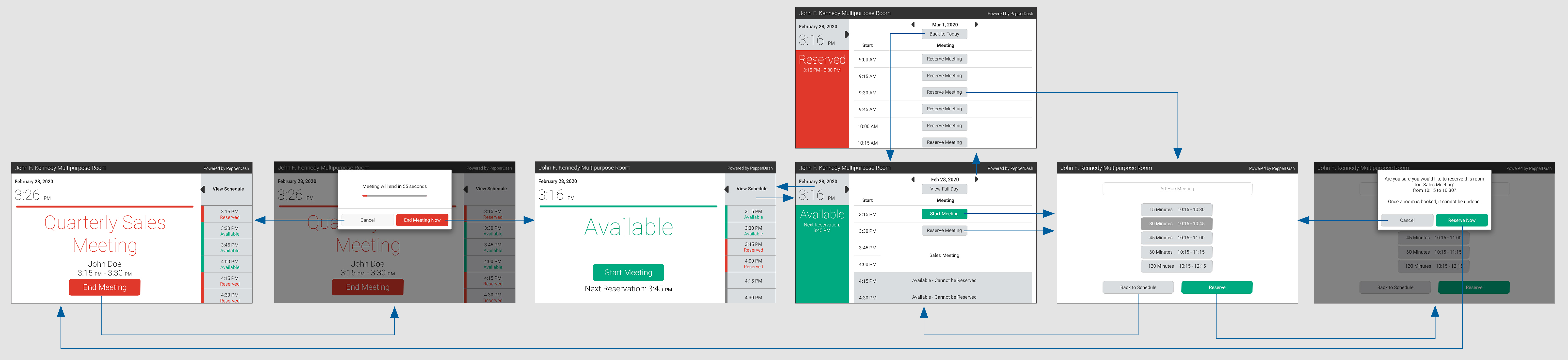
I designed this a few years ago and was even able to build out the initial web app that ran on the panel, as I had recently taught myself HTML, CSS, and a bit of JavaScript. Part of my reason for doing it myself was so that I could show how it was meant to animate between the default signage screen and the detail view. Nowadays I would build it out in Figma. So I decided I would take the above wireframe and give it a modern-day, interactive facelift. I also updated and changed a few small things that bother me about the design in hindsight. Click below to view the prototype.